Challenge
The Customer is an enterprise specializing in the development, manufacturing and marketing of high-end mineral water. Its QIZHI brand is a natural gas-containing soda mineral water enriched with a variety of rare mineral ingredients. Customer hope that we will develop a new brand corporate VIS, visual identity and product packaging for this brand, and strive to make QIZHI a leading brand in the health beverage industry.
How to use packaging design to reflect higher-end brand direction? How to create a consistent product packaging system? With these questions in mind, we conducted a strategic exploration.
Insight
We have designed a comprehensive survey plan, combining semiotic studies, interviews, focus groups and home visits to better understand the production process of "healthy and high-quality water" and its unique characteristics. At the same time, a systematic analysis of the future development trend of QIZHI brands was conducted.
Appearance
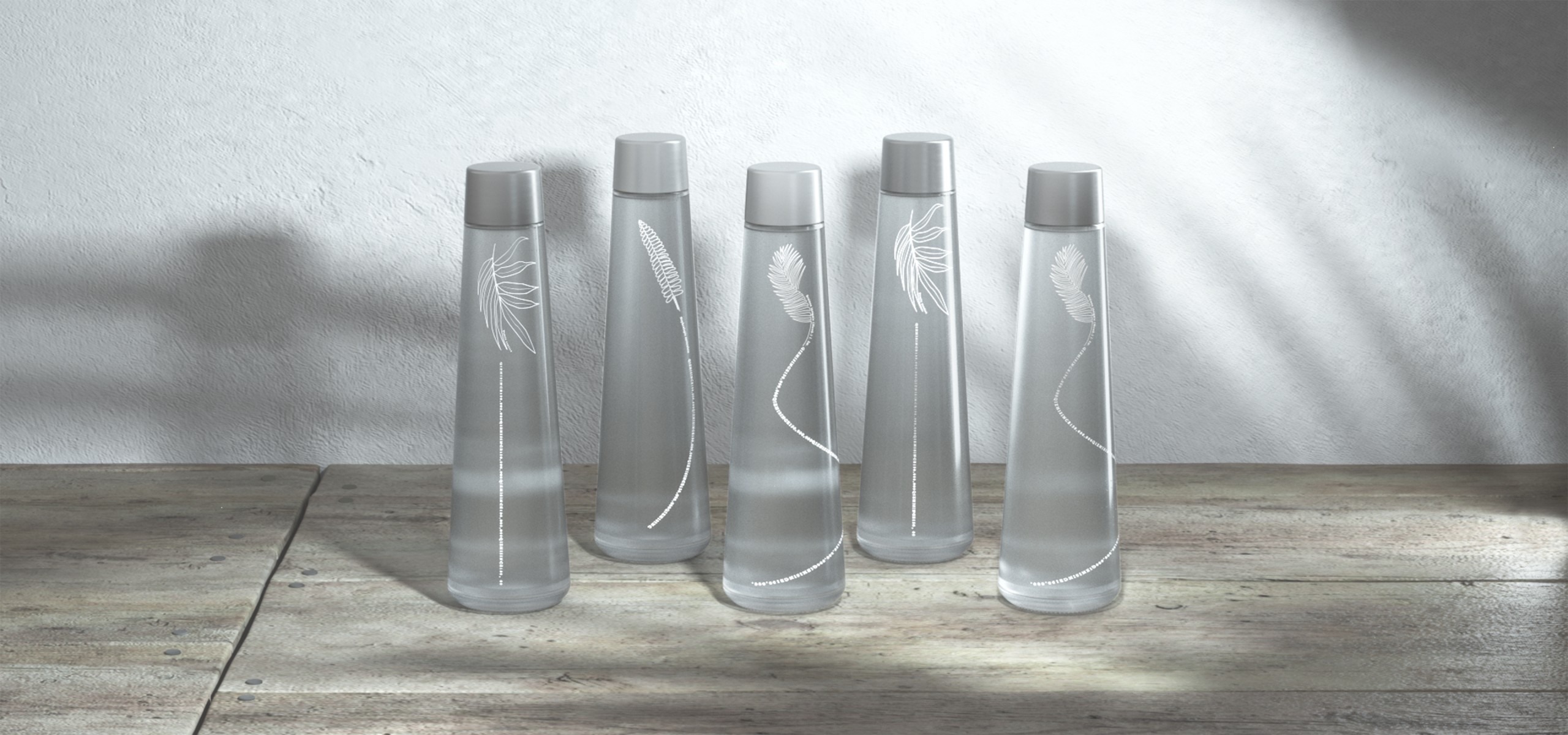
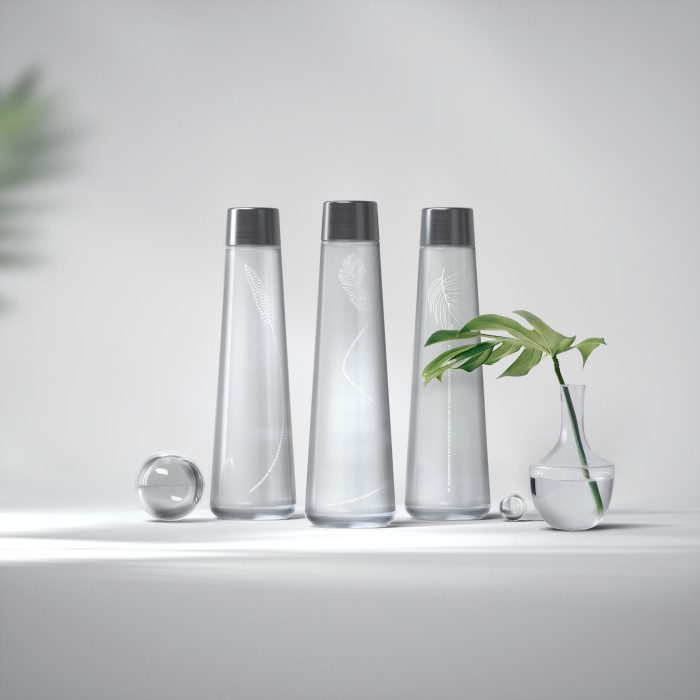
We have designed a packaging design called "Time", focusing on the concept of water rarity and time, adhering to the design concept of less is more, and outputting a simple bottle design with an overall shape that echoes the brand connotation.

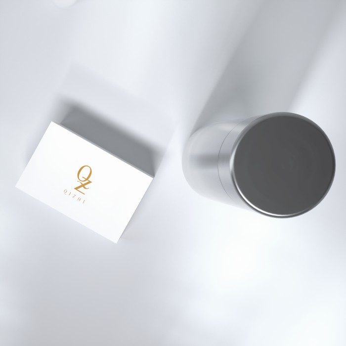
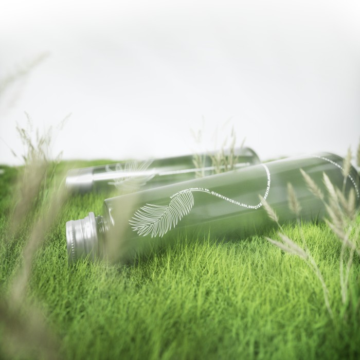
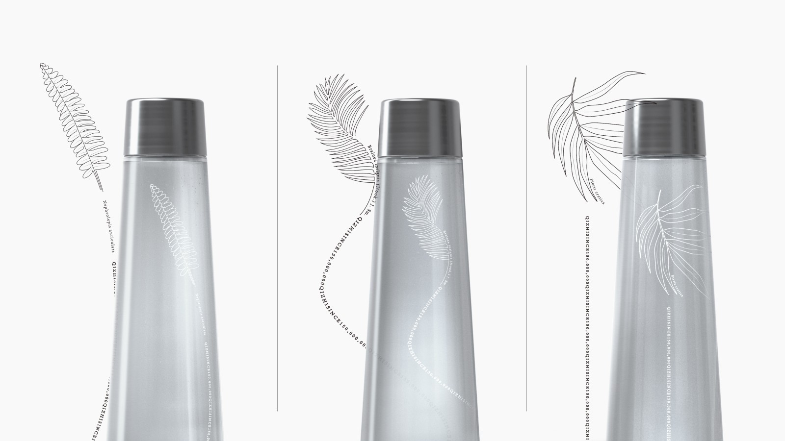
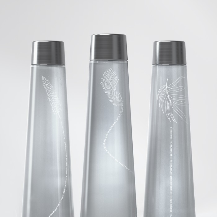
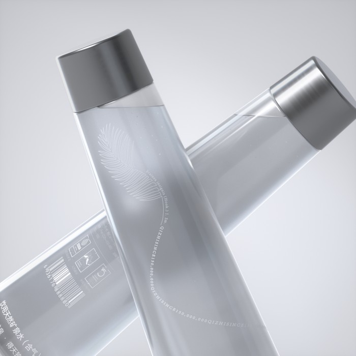
The shape of the bottle is simple, and the overall texture is matte. The silkscreen design on the bottle is based on the ancient plants of this water origin period, namely the Nephrolepis, Brainea, and Pteris cretica, which represent a long history. At that time, these plants nourished by this water have long ceased to exist, emphasizing the vintage nature of the mineral water, which is very precious natural healthy drinking water. We want to express brand attributes more clearly through a series of design languages.
Influence
Kurz Kurz Design (China) won the bronze award in the category Beverages-Water for his work "Time", proving the power of Chinese design to colleagues in packaging design worldwide.
Our mature product packaging design reflects the exquisiteness and elegance that QIZHI brands expect to achieve, ensuring it can successfully establish a high image of food safety and high quality in China. This visual language is also used in the entire series of packaging design and Corporate visual identity.

