Project Background
TOSHIBA—a Japanese home appliance brand that recreates Japanese lifestyle aesthetics—crafts appliances with care to deliver warmth, practicality, durability, and reliability. Collaborating with TOSHIBA, KKD established a new visual standard for the brand’s e-commerce product detail pages. This standard highlights the clear positioning and distinctive identity of TOSHIBA products across multiple dimensions.

Challenge Analysis
We analyzed TOSHIBA’s existing e-commerce product detail pages and identified key issues: the lack of brand presence, ambiguous positioning, disorganized visual logic, unclear information delivery, and the absence of prioritization for product selling points. Addressing these challenges, we started with targeted positioning and output design concepts from a user perspective to establish a new visual standard for TOSHIBA’s e-commerce detail pages.


Solution & Results
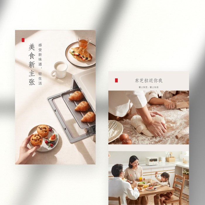
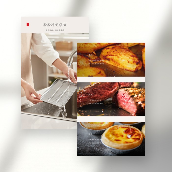
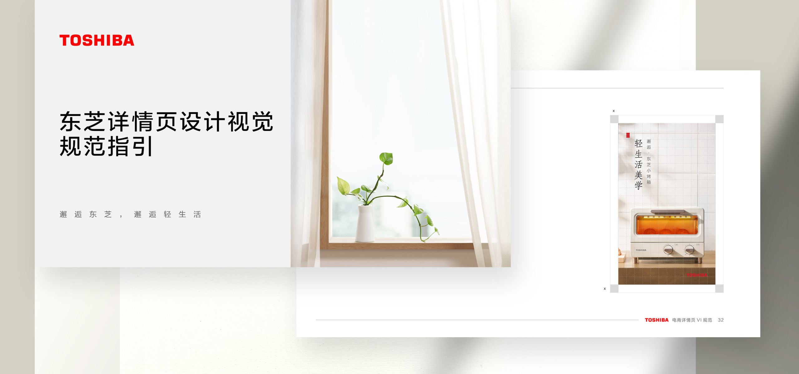
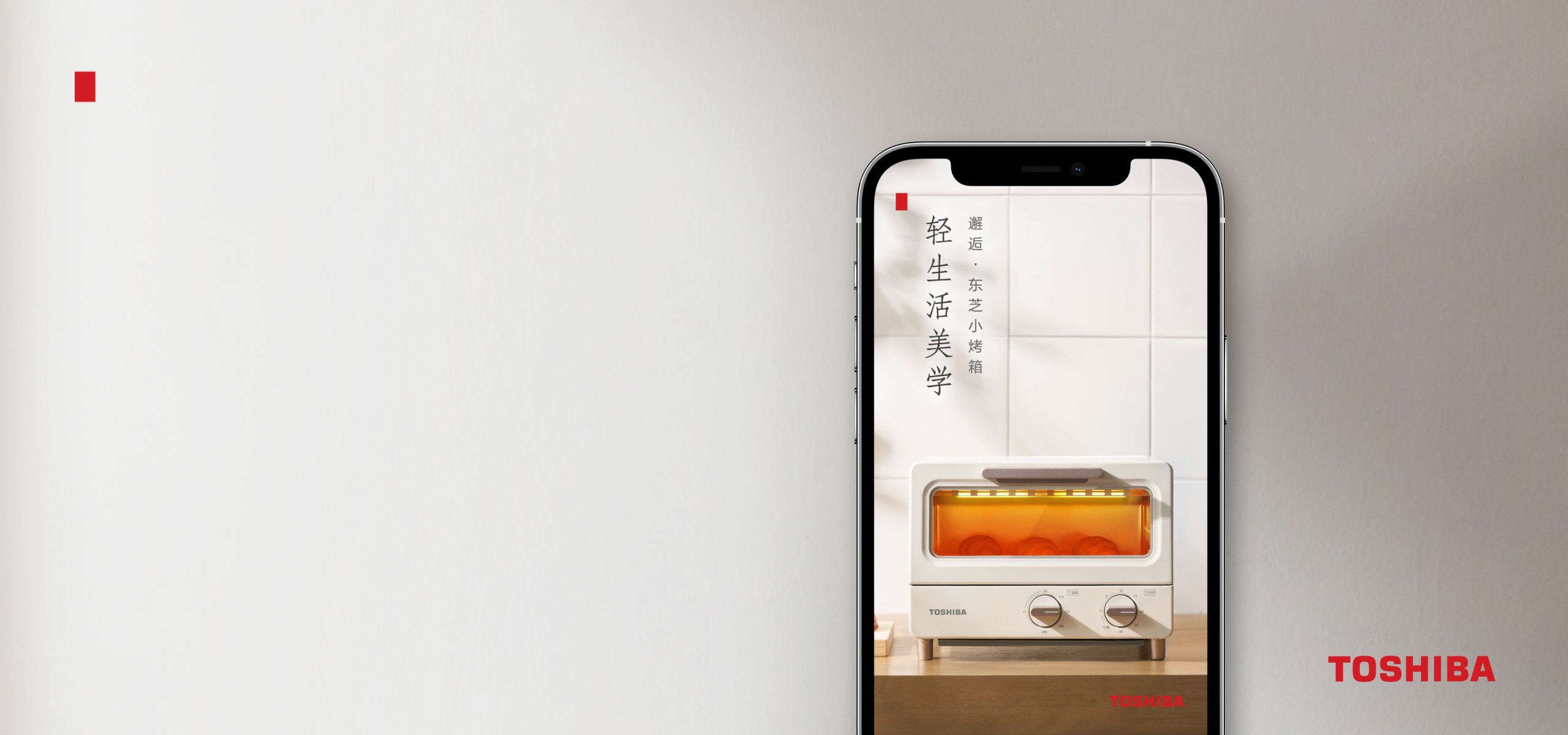
We established a new design standard for TOSHIBA’s oven-related e-commerce products across five dimensions: copywriting style, image application, text-image layout guidelines, typography and color standards, and the use of supplementary elements. The design concept “TOSHIBA is always here” was proposed to redefine the structure of detail pages. By applying Japanese-style text-image layout norms, typography, and color standards, we reinforced TOSHIBA’s brand identity. The distinctive “TOSHIBA Red Square” element was also introduced to strengthen brand personality, emphasize visual focus, and enhance visual appeal.

